Questions 1,2 & 3
Questions 4 & 5
Questions 6 & 7
Evaluation Script
In what
ways does your media product use, develop or challenge forms and conventions of
real media products?
My front cover follows usual conventions of real magazines
in terms of the layout. One example is emphasis on the lower left third that
exists in real magazines. Here I have placed important content such as the
barcode, price, promotions, website URL and QR Codes. This can all be viewed
from the shop shelf without other magazines covering the necessities.

I have mostly stuck to the original house style design that was created and the front cover has been inspired by ‘VIBE’ magazine. I have done this as the conventions utilised within VIBE are also suitable to address my target audience. The masthead and coverlines are also colour co-ordinated with black, white and red being used extensively. The image used on the front cover has been carefully selected from a shortlist of images from the photoshoot, I have gone with a medium close-up as the size will fill the front cover appropriately allow attention and detail to be given to the models face and clothing. The fact that the model is smiling is suitable as it will capture the attention of the audience and give an upbeat and positive feel to the magazine, fitting in with the ethos and mode of address used elsewhere. Although no makeup was used, the image was manipulated via Photoshop for some minor touch-ups that include colour balance and whitening of teeth in addition to removing some blemishes and marks on the skin. This slightly cooler hue was applied to the image to highlight and emphasize the whiteness in the T-Shirt that denotes freshness. The marks on skin were removed so attention isn’t detracted from the front covers coverlines.

I have mostly stuck to the original house style design that was created and the front cover has been inspired by ‘VIBE’ magazine. I have done this as the conventions utilised within VIBE are also suitable to address my target audience. The masthead and coverlines are also colour co-ordinated with black, white and red being used extensively. The image used on the front cover has been carefully selected from a shortlist of images from the photoshoot, I have gone with a medium close-up as the size will fill the front cover appropriately allow attention and detail to be given to the models face and clothing. The fact that the model is smiling is suitable as it will capture the attention of the audience and give an upbeat and positive feel to the magazine, fitting in with the ethos and mode of address used elsewhere. Although no makeup was used, the image was manipulated via Photoshop for some minor touch-ups that include colour balance and whitening of teeth in addition to removing some blemishes and marks on the skin. This slightly cooler hue was applied to the image to highlight and emphasize the whiteness in the T-Shirt that denotes freshness. The marks on skin were removed so attention isn’t detracted from the front covers coverlines.
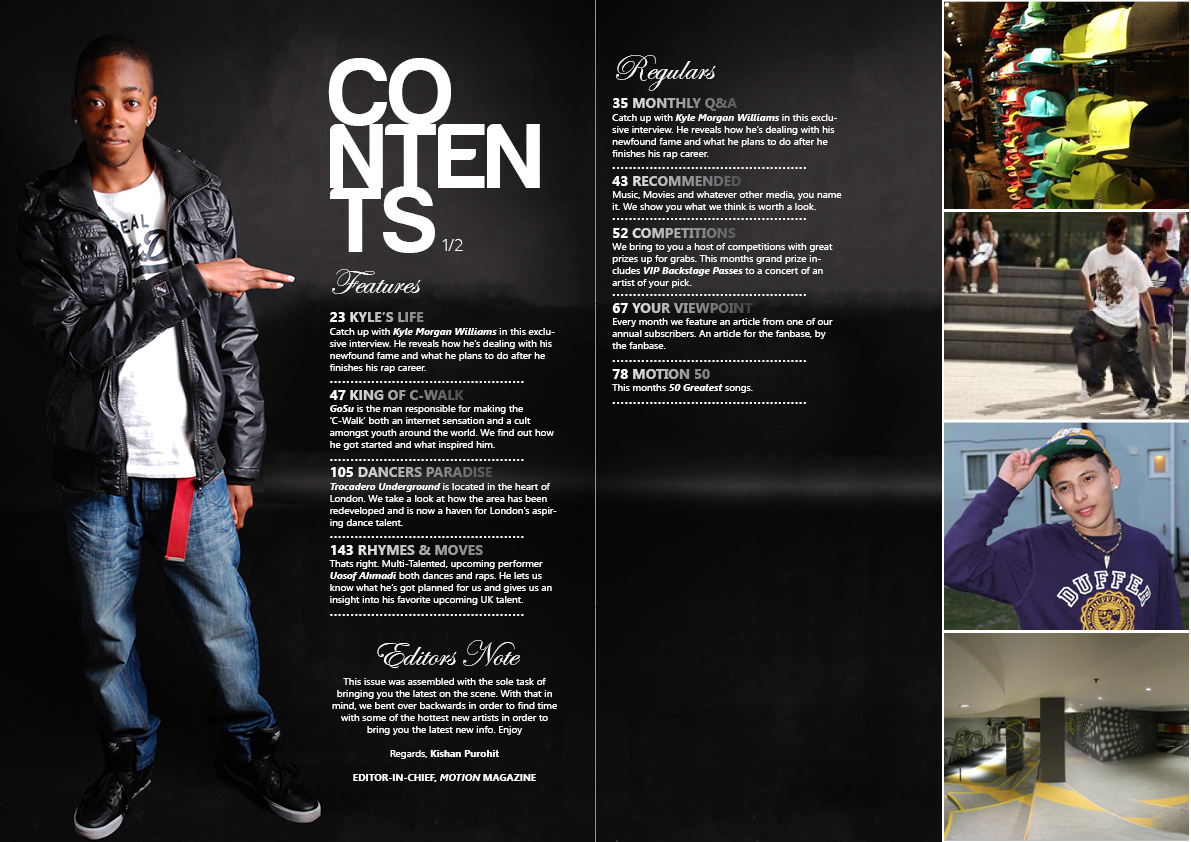
The contents page takes a unique approach in the fact that
it’s spread out over two pages. I required this extra space in order to not
compromise on creative quality and cram the contents in to a single page. One
reason for the extra space used is the relatively large font size used in the
masthead and large image of the model used on the left hand side of the
contents page. I have formatted the word ‘Contents’ in a way that is similar to
how VIBE magazine have done so. I have done this as it deviates from the usual
way in simply writing contents on one line thus adding to the aesthetic
quality. I have drifted from my initial house style plans due to needing to
accommodate the extra content; however this was a necessary change in order for
me to deliver the magazine contents in a minimalistic, black and white fashion.
I have gone for a classy look and have achieved this via symmetry used between
layers in the magazine and even spacing between page numbering and their
respective article descriptions. The classy, minimalist feel has also been
aided by the font styles used and the fact that the white font colour contrasts
well with the black backdrop. For column headings I used ‘Edwardian Script ITC’
as it has a real prestigious and somewhat formal feel to it. For article
listing headings I used ‘Segoe UI’ due to its boldness and uniformity. I also
applied a white to black gradient to the article listing headings as it fits in
nicely with the colour scheme and draws the audience attention to them. I have
made extensive use of on-location photography in particular and have used a
variety of shots with each one associated with one of the articles listed.


How does your media product represent particular social group?
The social group I have used consists of a large majority of my audience. That is 16-24 year olds that share a common interest, the interest here being celebrity and pop culture. The thing that defines them as one social group is that they share one type of culture and share the same values, thus bringing them together and allowing them to enjoy the magazine. The magazine as such, has been catered for them and the mode of address has been designed to be understandable, relatable and friendly. Using too much of a formal tone will not appeal to the social group as they want to feel at ease when reading the magazine. The celebrities and music artists are not likely to use a formal tone during communication so addressing the audience using a formal tone will break the connection they are meant to feel with the artists. The social group is mostly going to consist of teenagers from urban areas whose parents are likely to be working/middle class. They aspire to be like the people that will be featured in my magazine. In terms of ethnicity, the magazine promotes a mixture of ethnicities celebrating modern hip hop culture and this is evidenced simply by the range of skin colours that can be seen in images throughout the magazine with one image in particular showcasing a group of 30+ dancers with a variety of different ethnic backgrounds. This is done in order to make the culture accessible to anyone who feels they may enjoy it. This challenges the conventional stereotypes of the past that rap artists are only of colour and aims to take the hip hop culture into a new, non-discriminatory era. Overall I would say the representations in my magazine of the social group highlighted above are positive and aims to promote progress and productivity amongst them.
What kind of media institution might distribute your media product and
why?
Future Publishing PLC would be ideal as they already have a wealth
of experience distributing UK based magazines. I liked their modern approach
and the fact they are keeping up to date with technology. They are actively
selling magazines via their app in the Apple App Store. This alone has generate
over £5 Million since its launch
They also have credentials as they have done distribution for a
number of big magazines such as Official Xbox Magazine & EDGE to name a
few.
This experience makes them trustworthy to distribute my magazine.
Who would
be the audience for your media product?
How did
you attract/address your audience?
After asking my peers, there was a large consensus that one of the focal selling points of the magazine was the model used on the front cover. The feedback generally pointed out that the model used was an attractive young man, thus capturing the attention of female viewers and also being used as a role model figure for male readers due to the clothing and obvious denotation of power that stems from being famous and being on the front cover in the first place.
The mode of address used in the magazine is one that is friendly and slightly informal, making the reader feel familiar as the language used is one that they are likely to experience in daily life. This sets a more personal form of adressing the reader and may entice them into reading further as they feel like they are being spoken to rather than reading an article that has been printed en-masse.
For example, in the editors note, the editor addreses the reader directly, pointing out "We bent over backwards in order to bring you the latest on the scene". This is an example of the informality used throughout the magazine.
The colour scheme has also been designed with the audience in mind and their specific interests. The hip hop scene is associated with street art such as graffiti so vibrant colours were utilised in the magazine. Warm colours such as red were used rather than cooler colours.
What have you
learnt about technologies from the process of constructing this product?
I have learned many skills whilst undertaking the
construction of my magazine. I learnt about the image manipulation technologies
used in Photoshop whilst designing my front cover and editing the model. During my use of Photoshop I learned how to manage different layers and how to
I learnt about the conventions of magazine articles in terms of pull quotes and drop caps in articles. Subsequently I featured these in my finished product.
I learnt about the conventions of magazine articles in terms of pull quotes and drop caps in articles. Subsequently I featured these in my finished product.
Looking
back at your preliminary task, what do you feel you have learnt in the
progression from it to the full product?
I feel with my preliminary task there were many things that were
done that do not usually follow the conventions of a professional magazine.
Receiving and evaluating my feedback has allowed me to analyze and evaluate
those problems and subsequently go on to rectify them using the skills I have
developed whilst using the software. The more I used it, the better I got.
One aspect of the construction that became easier as time went on
is making sure all elements are aligned, such as text, images, mastheads, and
other features.